According to Plan
Every project starts with a blank page, and those first few marks can be tough to make. I'll start with a pencil and paper, shift to marker and trace, get up for a cup of tea, start a CAD drawing, and then go around again. I want to stay as open as possible to how a customer, site, and program might come together to form a concept for a house. I’m searching for something, not yet a plan, although diagrams exploring spatial relationships might be a first step. There will be ideas and images floating in my head, inspired by the site or a formal concept. But it’s all pretty vague until a plan starts to take shape, with those first sketches being fragments of an order I’m trying to find. I think of it as establishing a connection to a project, a way-in so to speak. Depending on its suitability, that initial order might carry on throughout the project, merge with new ideas, or be discarded along the way.
I began my practice at a drafting board, unfurling miles of tracing paper in the process. Since then I’ve adopted computer drawing and have embraced the advantages of working on a screen. Once I’m into a project I tend to jump around from plans, to sections, to elevations, to details, and CAD drawing has enabled me to do that more productively than hand drafting ever could. And 3D programs allow for quick explorations and walk-through visualization of spaces far easier than building traditional models or perspective drawing. But I do love the art of draftsmanship and it’s sad to see the demise of the craft. There is an apocryphal story of Frank Lloyd Wright conceiving Falling Water entirely in a furious two hour drawing session while his patron drove to see him. Wright had procrastinated for 9 months, no doubt working through ideas in his head and at least sketching. A struggle to conceive, a period of gestation, and then the manifestation of a project fully rendered. For whatever truth there is to the story there is something to be said for nurturing the process.
Back at school in the 1980s there was a lot of emphasis placed on having a project concept. It was a time of reaction against the 1970s architecture of banal shopping malls and public structures. Work was thin, and architects were looking far and wide for inspiration. A concept could come from anywhere– a story, work of art, social agenda, theory, geometric form, whatever. What mattered was how the concept was translated into form, and that’s how it was judged. If you could weave a compelling tale of meaning during your critique, it was of no matter how your project stood up or if there were any bathrooms. You could learn all that practical stuff in an office. Design studio was a place to find your voice. The emphasis on concept did keep us pushing ourselves to find paths worthy of exploration.
For me that search continued into practice, with each project being an opportunity to create something purposeful and unique for a particular customer and site. Though I find the notion of project concept still important, I discover it more often through the act of design rather than trying to pin it down before starting. To describe the process I’d say it’s an exploration of the relationship between form and the narrative of use. I might begin with one or the other, though ultimately architecture is about how the two are woven together. In the discovery of that synthesis there is a kind of alchemy that can happen, when the two come together with what feels like a certain inevitability. Giving a specific name to the concept might not be easy, or it might even come long after the project is built.
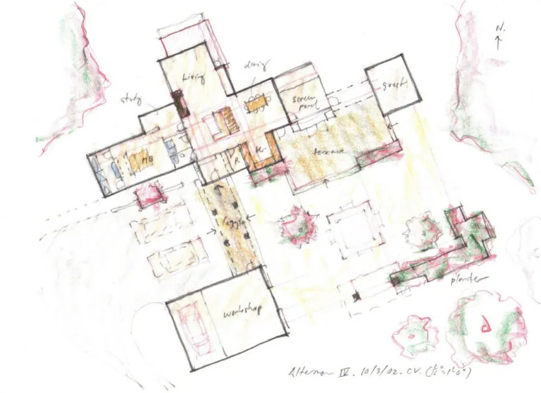
A more traditional notion of architectural concept is that of the parti, from the French phrase prendre parti, to make a decision. It is the chief organizing idea of a design in a formal sense, whatever the theoretical framework might be. This idea can often be captured in a plan sketch. For example, compact plans are certainly more efficient than articulated plans, but the embracing wings of a home create exterior spaces that more easily blur the lines of interior and exterior. The movement of sunlight through a home can be another generative aspect of design. Orientation, clerestory windows, 2-story spaces and light wells can map the sun’s journey through the day. These relationships can be better explored and captured in a building section, which might then be used to convey the parti for the project. In this era of design complexity, fully rendered 3-dimensional models are even developed at the conceptual phase. Even then, one can generally trace the generative idea to a plan and/or sectional drawing.
Specific planning strategies include the notion of servant and served spaces. In home design, utility spaces such as mud room, laundry area, bathrooms and closets can be grouped toward the less desirable side of the house, leaving the served or living spaces to occupy the prime real estate. This split might occur along the lines of orientation for sunlight, the proximity of neighbors, views, or other site features. Served spaces are naturally designed to be more generous in size and daylight. Circulation spaces might be arranged to minimize hallways and include extra width for built-ins, resulting in a smaller, yet more interesting footprint. Whether those built-ins are executed in fine woodwork or as a D.I.Y. project is not as important as the spatial planning that establishes the order.
Given typical construction methods, rectilinear spaces are easier to build. This leads to a predilection for the alignment of walls within the plan both for structural purpose as well as for ease of circulation. Working as an office boy back in the day a senior draftsman put it to me like this, ‘You try to line things up, it looks better that way’. Symmetry is another natural order of design. From the Greeks and Romans we learn the power and beauty of platonic forms, though on a larger scale their buildings often rotate and collide in response to the site. Renaissance architects employed symmetry across large compositions with multiple wings, resulting in a rather stiff formality. In residential design, a strategy of local symmetry can work well, where a particular room, entry porch or façade employs symmetry, while the overall home responds more naturally to use and site. In a different approach, elements are set in a balanced asymmetry, exemplified by Japanese gardens and De Stijl compositions.
Other than aspects of alignment and balance in design, are the principles of energetic flow, a.k.a. Feng Shui. If you consider space to be a fluid like water, this notion will make more sense. Aspects include avoiding direct alignment of doors, so incoming energy doesn’t fly right through a space and back out again. Also to be avoided are poison arrows– corners and other elements that can disrupt or fracture the flow of energy. I agree with many of these principles, but I think about them intuitively rather than as a rigid set of rules. For a home, one strives to create a spatial flow like a gently flowing river, with a meandering course including small eddies, larger pools, and occasional rapids.
Colliding and curving forms signal a departure from the norm, adding complexity to a project. Angled geometries can create a unique response to the particulars of a site. So it is with curves as well. The notion of a curvaceous earth dwelling half buried in the ground, or a sleek elliptical house rising out of a field are ones that appeal to me should the opportunity arise... As in life, there is always a plus element of design, learning from each project and trying something different each time. The challenge remains to balance the internal negotiation of firmness, commodity and delight, Palladio’s trinity of design, into an efficient and pleasing gestalt. All of these considerations and more can be contained within the parti. For the designer who considers deeply how form and narrative come together, a plan sketch can convey a wealth of thought and information that might not be apparent to the casual eye.
*Our title is borrowed from the recent book according to plan authored by Rob Kovitz, my former partner in Small Building Company. It is a curious look at our obsession with making plans, be they found in plot narratives, data collection, design, and a multitude of other endeavors. Check it out at treyfbooks.com.